The presentation below is an analysis of 4 cover pages from 4 different school magazines. (Uploaded on 18/11/15)
The slideshow below is an analysis of 4 content pages that I did from various school magazines. (Uploaded on 18/11/15) This is where I have analysed the results to my school magazine survey. Below I have analysed the results for my survey by explaining how I will use them and what the results tell me. (27/11/2015)
School Magazine Survey Analysis from Hubert Dudowicz
Below is my magazine mock up that I have created to give me an idea of what my magazine front cover will look like. I made this mock up using Microsoft Publisher as it is very quick to use while still enabling you to make a quality magazine page. (09/12/2015)
Below is my magazine mock up that I have created to give me an idea of what my magazine front cover will look like. I made this mock up using Microsoft Publisher as it is very quick to use while still enabling you to make a quality magazine page. (09/12/2015)
Magazine Mock Up - 09/12/2015 from Hubert Dudowicz
Below is a drawn design plan for my magazine which I've labelled. (11/01/2016)

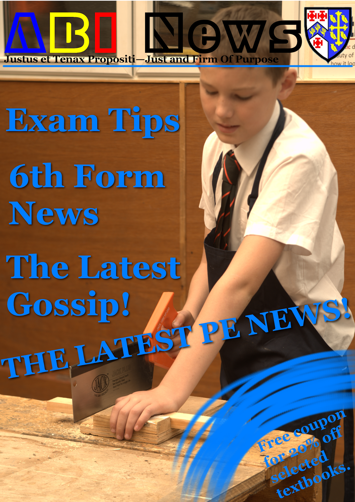
This is the final version of my magazine cover that I will use. I believe that my cover page is quite aesthetically pleasing in terms of the colours used, layout and language. The first third of the contents page is used to show the user what the magazine is about as soon as they look at it. I made this final version in a program called GIMP (GNU Image Manipulation Program) as it is almost identical to professional software such as Photoshop when it comes to tools and freedom one has over editing the image. (14/12/2015)
I made a mistake in my spelling of the word "coupon", as pointed out by James, showing that I've improved using the comments of my peers. I've corrected this spelling in the version below.
In my contents page, I've used a declarative statement that states the gossip in the magazine is the "latest". This will make the reader feel that they are keeping up with the gossip at school. This fulfils the surveillance part of Blumler and Katz's theory of Uses and Gratification. It also plays into the Love and Belonging part of Maslow's Hierarchy of Needs as people at school expect each other to keep up with what's happening at school.(11/01/2016)


Below is a drawn design plan for my magazine which I've labelled. (11/01/2016)

This is the final version of my magazine cover that I will use. I believe that my cover page is quite aesthetically pleasing in terms of the colours used, layout and language. The first third of the contents page is used to show the user what the magazine is about as soon as they look at it. I made this final version in a program called GIMP (GNU Image Manipulation Program) as it is almost identical to professional software such as Photoshop when it comes to tools and freedom one has over editing the image. (14/12/2015)
I made a mistake in my spelling of the word "coupon", as pointed out by James, showing that I've improved using the comments of my peers. I've corrected this spelling in the version below.
In my contents page, I've used a declarative statement that states the gossip in the magazine is the "latest". This will make the reader feel that they are keeping up with the gossip at school. This fulfils the surveillance part of Blumler and Katz's theory of Uses and Gratification. It also plays into the Love and Belonging part of Maslow's Hierarchy of Needs as people at school expect each other to keep up with what's happening at school.(11/01/2016)
Below is a picture of my final contents page that I will use in the magazine. I feel like I've managed to create a simple yet appealing contents page that clearly serves its purpose. (04/01/2016)

Analysis of Cover and Contents Page and How I Feel I Have Done (04/01/2016)
Cover
My cover page has a masthead that is in 4 separate colours, three of which represent the school as they are the colours of the school badge. This is very eye catching to the reader as the badge and masthead are similarly coloured. There are three cover lines in the first third of the magazine. The reader will see these first so I made sure that they are appealing to the reader. There is also one main sell line that will grab the reader's attention.
On my cover, I feel like I did a good job at creating a sleek look for the magazine. I've made my cover look simple yet professional which is important as my magazine aims to target many age groups. I feel like I've managed to convey what the school is about through my use of colour and other such design choices. However I think I could have changed the streak I used in the bottom right corner to make it more consistent with the rest of the cover page.
Contents
My contents page is very minimalistic and focuses on giving the reader a positive impression of the school. All of the text on the contents page is white so that it stands out from the background picture but doesn't distract the user from it while still informing them about the magazine. I've used pictures that are related to the sections of the magazine that are displayed on the contents page. There are three images at the bottom, two of which relate to the PE news on page 5 while the third image and background images work to show the school as being very academic. My contents page is very straight forward and doesn't describe any of the pages as the titles of them are self explanatory. I used a declarative statement at the bottom of the list that informs the user of the 20% off coupon that is included with the magazine.
I think that I've managed to create a simple yet effective contents page that displays the needed information as well as showing some images that I've analysed which are relevant to the topics listed on the contents page. The only thing I can see that I could have done better is having have used a different colour of text which stands out more from the background than this one.
Below is a slideshow that I created in which I analysed 12 images and described the choices for using said images in my cover page and contents page. (06/01/2016)
Below is an analysis of Bauer Media and Kerrang! (Uploaded on 28/01/2016)
Below is an analysis of some Kerrang! contents pages. (Uploaded on 20/04/2016)
Very good and polished. Very in depth but you may want to improve your cover as you spelt "Coupon" wrong.
ReplyDeleteYou have used a good and clear portrayal of your magazine through the use of GIMP. I personally like the brush stroke and the school house style colours in the text. Although you could improve on the look of the magazine as it doesn't look completely professional.
ReplyDeleteWell done hubert you have gone in depth in the analysis of your magazines and have used detailed and intricate terminology in your analysis and creative designs.
ReplyDelete